Thursday, March 31, 2011

Dog Toy Box


 Kate & Sawyer needed an easy access toy box.  You can spend all kinds of $$$ on dog toy boxes - but I saw it as a chance to recycle!

Ta-Dah!
I cut down the front part of the box to make it easier for our little gal to grab a toy.  Then I used Claudine Hellmuth's gloss medium with a sponge brush to "decoupage" paper to the outside.  I just went ahead and left the inside as-is.

 I picked up the K& Co. stack "Donna Ingemanson" for a song at a recent scrapbook show.  The stack, very unlike my style, was geared towards boys.  I liked it for the "reverse" side of most pages as it was just bright, bold graphic stripes, dots, & plaids.  One page had all these fun words & phrases on it.  With all the recent Charlie Sheen hype, I just had to put "winner" on the front as a bit of a joke.
There was more box than paper, so I supplemented the space with a contrasting design that had the edges punched with one of my fave EK Success punches.
 Now if I could just teach them to put their toys back at the end of the day....

Wednesday, March 30, 2011

Glitter Lace Video Tutorial

To see the post featuring my very first Glitter Lace card click here.  This technique is so simple.  No special supplies required, just things most crafters have around.  I use inexpensive labels (4x5") so I don't feel bad trying lots of different glitter color combos.  Try it, you'll like it!  Thank you for having a look.

Glitter Lace Supplies:
  1. Micro-fine synthetic glitter, 2 colors.  I used Barbara Trombley's brand.
  2. Some sort of adhesive sheet - sticker paper, ScorTape sheets, or as I use, copier labels - any size.
  3. Relatively flat, synthetic lace.

Sunday, March 27, 2011

Week 8 Sketch Pt. 2: "Less Is More" Challenge Blog

 Round 2 for the LIM Sketch challenge this week.  The image in the lower right its supposed to be a circle.  I tried to approximate it with a patch of yellow Angelina Hot Fix Fibers behind the stamp image, but I concede its not so apparent across the top.  I hope it makes the criteria.

Believe it or not, I didn't notice the larger, heavier strand of fibers arching out over her head until I viewed the photos.  Crazy how that is sometimes.  I went ahead and pulled it out, but due to lighting issues I've chosen to post these photos.  Sometimes those irregularities are what confirms the "hand" in handcrafted!
 I just purchased some polyshrink and this is my first time using it.  I just heated it on my craft area - I always thought you needed an oven until I saw a demo from these folks.  How fun!  The Easter grass looking stuff is called "Angelina Hot Fix Fibers."  They don't have a web presence, but I sure had a lot of fun learning about this great product.  This week I'm going to post a video tutorial on the fun things you can do with this product and how you can get your hands on some too!  Stay tuned.

Bazzill Basics cardstock.  Polyshrink in transparent.  Prismacolor pencils and OMS.  StazOn in in black.  Stamp unknown.  AHFF in Lemon and Mango.
 Here's what the AHFF look like when you purchase them.  A bold line stamp, some Brilliance ink, and a warm iron are all you need to make dazzling embellishments.
Hope you'll check back for more how to's coming up.

Week 8 Sketch: "Less Is More" Challenge Blog

The video tutorial for Glitter Lace is now posted on my blog here, or on my YouTube channel.
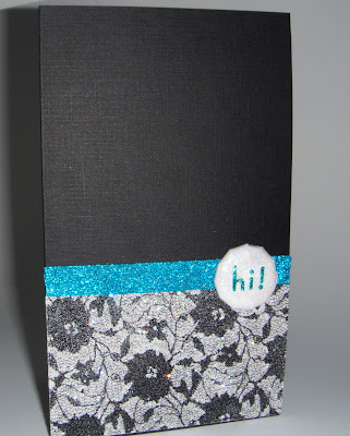
 There was a rubber stamp show here in Portland over the weekend.  I learned this fabulous "glitter lace" technique.  So simple for such stunning results!  It was a challenge to get all the sparkle and glitz to photograph well, but I think you get the idea.  I used the technique to create a card for this week's sketch challenge over at the LIM challenge blog.  Goodness, there is so much talent and creativity to be found there.

https://blogger.googleusercontent.com/img/b/R29vZ2xl/AVvXsEjYllVXc9lpy6LIPBGPuB5E-VQcG_ywCkHozU2AW7jh_zoToI-Y4vAN7OCsAWKEu6VL1JnTlUpoaXvf2RcEpSSD0iFQRhzZgZSKw-aFAqvY3IM53m_IJ5Zts8cpM1LT7z9ZNEid5RSBjsom/s1600/Less%252Bis%252Bmore%252Bsketch%252B1.jpg 
Here is the sketch for this week's challenge.
 It may look like there's actual lace on this card - but really its all glitter.  The lace only acted as a resist.  I will post a video on this technique so please stay tuned, or subscribe, to learn more.
 Tools are a big part of what's fun about crafting, wouldn't you agree?  My husband's 12 y.o. was more than ready and willing to help out in the creation of this simple glitter brad using my iTop bradmaker.
Here are pretty much the supplies I used to make this card.  Easy-peasy... and fun!  Let me know what you think, I really enjoy all comments and critiques.  Happy crafting!

Sunday, March 20, 2011

Masculine (pt. 2): "Less Is More" Chgallenge Blogspot

 So here we go with another round of masculine cards on the oh-so-fun LIM challenge blogspot.  My husband is a golf fanatic!  In fact, what's he doing on this blustery weekend afternoon - watching a tourney on tv.  Conditions aren't great for play, and as we currently live on a course, he can afford to be picky.  I could also give this card over to his dad who plays about 250 rounds a year during retirement.  In my house, this is definitely a guy's card!

Unknown cardstock in cream.  StazOn black ink.  CTMH "Tee Time" Stamps*  Natural colored cording.  I had thought to add the ball hanging from the cording, but decided "less is more."

*This set of acrylic stamps has gotten quite sticky.  After inking them up they actually would stick to the cardstock, tearing it a bit.  Hence the sort of blotchy effect was the best I could achieve.  What to do?  Sand them with some fine grit sandpaper?  Hmmm...?  Anyone else have this issue with acrylic stamps?  Set is probably only 2 years old and stored away from light.


My husband's 12 y.o. son is loving Tae Kwon Do.  At his next belt test he will be going for a green belt so I thought this would be great.  Interior of the card is handwritten, "Focus!  Confidence!"  This is what the kids shout out before breaking a board to complete the test.  I wanted the paper strip and knot to resemble the belts of his uniform.

White cardstock and Bazzill Basics cardstock in green.  Alphabet stamps from PSX: Celtic.

Thank you for stopping by.  I appreciate all comments and critiques.

Saturday, March 19, 2011

Masculine: "Less Is More" Chgallenge Blogspot

I thought this would be a good card for my husband's 15 y.o. who recently upped his grades in an effort to be eligible to get his drivers permit.  It'll be fun when he's finally driving!

White cardstock, 5x5".  Arrows from Graphically Speaking cart cut from black Bazzill Basics cardstock at 4x1.5".  Scrap paper backing.

This week's theme for the LIM challenge was "Masculine."  I find it so hard not to ink the edges of my creations, striving for a true CAS card.  Sometimes the Spartan effect can be so powerful.  So I decided to draw a border with my fine black Sharpie.
 Well, wouldn't you know it.  On the back side of my ruler was some leftover black StazOn ink!  Aaarrgghhh!  So now my "clean" card has a black smudge on it.  I should have left it all alone.  I'm gonna come up with some cover-up, but I'm gonna let it percolate for a while.  Plus, I want my submission to follow the LIM challenge guidelines.
 I popped the arrows up on foam tape.
 I just scored the most fabulous deal.  I bought a brand new Graphically Speaking cart for just $17!  They may be retiring this one is my guess.  One of my fave places for supplies is Oh My Crafts!  I also scored the Stretch Your Imagination cart.  Two carts for around $36 total, including shipping.  Such a deal!  http://www.ohmycrafts.com/
 As you can see, I can't take credit for any originality on the card.  This is pretty much the very same cut out of the booklet.  I used my Gypsy for all cuts so the words would be embedded in the arrows.
 I found that I had lots of ideas for "gender neutral" cards, and this cart will be great for any card, any occasion.  I have some time to play so I'm gonna see what else I can come up with for this theme.  Stay Tuned.
Thanks for hopping over to my blog.

Friday, March 18, 2011

Off the Edge OLC: "Less Is More" Blogspot Challenge

Studio 112 Clear Mini Stamps, StazOn Jet Black ink, Prismacolor Pencils, OMS.

The sentiment on this card provides the reason I was only able to post this a day before this week's challenge closes!  There's one of those in our imminent future.

To see more stamps in this line, as well as the great price I picked them out from, check out my other post here. 
TFL!

Saturday, March 12, 2011

Challenge #50 "Tree Time": Fantabulous Cricut Challeng Blog

Challenge #50 "Tree Time"


The challenge was to create a cricut cart project with a tree. I don't ususally create whole scenes like this so this was a stretch for me.  There are some SUPER talented posts on this challenge blog.  I only hope I can do justice!

I used Paper Pups for all cuts.  Bazzill Basics cardstock, K& Co designer paper.  Distress Inks, Prismacolor Pencils & Sakura White Gel pen for coloring.  Card is 5x7".  

http://fantabulouscricut.blogspot.com/2011/03/challenge-me-monday-50.html

DL Art Giveaway; STVSKSP16

Fellow blogger Diana has reached 200 followers and is having a giveaway!  For a chance to win some of her cards and a $15 Michaels GC check her out at her DLART blog! Congratulations Diana!  Ends March 19, 2011.


*****************************************************************

 Here's a peek @ my submission for this week's Sketch Challenge over @ Stamp TV.  STVSKSP16

Gosh, I feel  I really have been challenged with the the sketch and color challenges @ Stamp TV lately! I wanted to do something that wasn't an exact copy of the sketch itself, so I thought about using ribbon to achieve the same graphic effect instead of just paper piecing.  Again I went to my scrap files for the paper and colors.  I picked up a few delightfully whimsical stamps in the dollar bin @ Joann's, & just had to use them here.  Think I'm gonna add stickles to the collar when it's all said and done. Thanks for taking a look!

Cardstock (base) Bazzill Basics.  All other papers, recycled.  Trimline Ribbon.  Dog Bone, Paper Pups cart.  All other cuts, various from my Gypsy.  Stamps from Studio 112, Clear Mini Stamps.  Versafine black ink, Stormy Weather Distress Ink.

From the $1 bin @ Joann's


Tuesday, March 8, 2011

StampTV Color Challenge: STVCSP14

The challenge colors are Wild Dandylion, Red Hot, & Black Onyx.

Stamp is from Pando-Monium.  Cardstock from Bazzill Basics & recycled.  Offray ribbon. Barn Door Distress Ink.  Prismacolor Pencils. Designer Paper is a StampTV freebie, Lemon Drop Digital Paper from GKD.

Check out the fun challenges, the community, and download some freebie papers at StampTV, or visit my page for a look and some inspiration!

Sunday, March 6, 2011

Pastels (2nd Try): "Less Is More" Blogspot Challenge

I think I may have it right this time.  Maybe...  I hope it was OK to use just one pastel color. And I too agree, black is a great anchor color when using this palette. Oh well at any rate I do love making cards for this challenge, can't say it doesn't INSPIRE me to keep creating - even if I do flub up here on the world wide web!

"Inspire" was from Gypsy Wanderings cart.  Paper from Bazzill Basics. ScorTape in 1/4" & 1/8". Black glitter from Art Glittering System, and pale aqua is a bazillion years old, unknown.  Thanks for taking a look!

simplylessismoore.blogspot.com

Big Goof! Pastels: "Less Is More" Blogspot Challenge

I'm so embarrassed!  I don't believe this hits the criteria for the Less Is More Blogspot Challenge.  I mistook "negative space" for "white space." Clearly there's no white space in this card!  My Goof!


Since you're already here, if you want to take a peek...My little ingenue is my sweet niece, who's more than twice the age now than when this photo was taken.  I am like a blind person stumbling around in a forest (all respect to the sight impaired) when it comes to using my Photoshop Elements 9.  I really need a class.  But here's what I did to make this card:

Opened up the photo and cropped it so Sylvia was more in the right third of image.  Used a tool (see, I don't even know what its called) to select her.  Then I "wiped out most of the color" on the background.  I thought about toning down her jacket, but decided to keep it just as it was.  I then printed it out on normal, cheap copy paper because it had sort of a muted, grainy effect.  I then chalked the yellow and pink flowers and the blue sky for the old-time pastel effect.

Next came the layering of an assortment of ribbons in the same chalk pastel colors (Offray, American Crafts, Target).  The acrylic sentiment (Junkitz) was adhered with Glossy Accents.  All was layered on  black and pink pastel cardstock (Bazzill Basics).


It was difficult for me to get a good picture what with my current lighting conditions and the pastel.  I boosted the color a little in iPhoto just for this post.
The acrylic embellishment says, "Growing In Leaps and Bounds."  Thanks for taking a peek.

Wednesday, March 2, 2011

FCCB 2.28 Shape Card: Lucky

For this week's Fantabulous Cricut Challenge Blog: Shape Card.
From the Storybook cart, pg. 76.  Cut on my Gypsy at 4".  "Lucky" from Indie Art cart loaded on Gypsy.

Accent blackout was selected, copied, flipped and welded to make card base. 
Accent frame was selected, and the "to" hidden so that it would not cut.  "Lucky" was selected and cut to fit frame size.  I hope to make this card again, and I will make it 51/2" or more.  4" feels so small.
Wow, did I have to dig deep to find cuts appropriate for St. Patrick's day!  Admittedly I don't own that many carts, but its amazing what you'll come up with when you have to dig deep.  I really love my CE, my Gypsy, and all the carts I do have!  These little clovers in the corners of this design were just perfect for what I wanted.  And I was all set to spell out and weld the word "luck" when by chance I hit the shift on the Indie Art cart and there was "lucky" already set and ready to go.  Amazing.  I hope you enjoy this card.


Craft Companions: Kate & Sawyer

My two furbabies are frequently with me when I'm crafting.  Sawyer's favorite spot is right by my feet under the desk.  When Kate settles down she cozies up in crazy spots, like between the lamp base or desk leg and the wall.  Neither of them like cuddle beds! I enjoy their company until I want to make a video - then they're always barking at the wrong time, so its, "out!"  Who's your crafty buddy?

Thinning the Herd

 I told myself I couldn't make any more cards until I "thinned the herd" a bit.  I keep my cards in plastic file container, both my homemade projects and store-bought, as I'm addicted to store-bought cards too!  Well, there comes a point every so often when I can barely fit one more card into the container - thus its time to clear things out a bit.

 As you can see I'm a fan of making envelopes.  I LOVE my MS scoreboard for this.  Some of the other envelopes were made with some ancient, old templates I've had that came in a book called "The Envelope Mill" that I purchased way back in the mid '90s.  It allows me to center a picture just so for the envelope.  I have stacks of calendars going back years and years for this.  If I have standard white envelopes, I like to jazz them up with stickers, stamps, coloring, or lettering.  I've done that here, but you just don't get quite the view.

No international or odd/bulky shaped cards in the batch today - whew!  Its amazing how expensive actually sending out my card creations has gotten over the years.

Just as I was finishing up, I spotted the mail truck at the box right outside.  A sprint between the raindrops got these fun creations out in time.  Is there one destined for your mailbox?

Tuesday, March 1, 2011

3 Squares: "Less Is More" blogspot challenge

I'm absolutely addicted to the challenges on this blog!

This is a plain white 4x6 card base.  I punched 3 1 1/2" squares from the same cardstock.  I inked the squares with a direct-to-paper technique in the primary colors, and inked around them and the card with black ink, and affixed the squares to cardstock, using foam for the yellow square.  Yellow square was stamped with sentiment. Its hard to see, but I scored two lines with my ScorPal underneath the yellow square, but then added black lines with a pen for more contrast. 

Ink - Memento, Dandylion; Distress Inks in Broken China and Barn Door; ColorBox Black ink; Black Sharpie marker.

simplylessismoore.blogspot.com

Card also good for Sketch Spotlight- STVSKSP15 on Stamp TV.


Here's one more that fits the LIM challenge.  The stamps are from a very old "quilt" foam stamp set of coordinating sizes of squares, rectangles, and triangles.  I just overstamped the squares with Distress Inks as mentioned, adding Spiced Marmalade to the mix.  The sentiment is only half of the image (I masked off the other words), and is from Serendipity Stamps.