Wednesday, April 27, 2011

From My Window: Our Cold, Rainy Spring

My husband bought me (well, us, but we all know its really mine) a new camera!  A beautiful new red  Nikon CoolPiX S8100.  Truth be told, it wasn't the camera I was pining for, but I've really enjoyed getting to know the features of this powerful point-n-shoot.  He is good to me... I really am a lucky woman!

I've not had any time for crafting, and what with a move imminent, probably won't for a while.  But I thought I'd post some pictures from the window of my craft room just for old time's sake.  Soon I'll be bidding goodbye to the familiar scenery of this HUGE craft room and office that everyone knows is my domain.

Here are a few facts about the supposed "spring" we've had here in the northwest.  April (4/20/11) facts from local weather guy Bruce Sussman's blog:
  • We had 29 of 31 days of measurable rain in March.  That includes 23 straight days of rain.
  • We didn't hit 60* until March 27, 2011.
  •  April 14-17 was the third wettest two-day period in April since the Portland Airport began keeping records in 1940: 1.68 inches.
  •  Portland’s average high is just 54.5 degrees this April. That’s the coldest on record. 
  •  Portland’s had just three days hit 60 this year. That’s the fewest on record for this late in April. In fact, in an average year, we’ve already had 19 days at or above 60 degrees!
  •  Portland’s overall average temperature this April (so this combines the high and low each day) is just 47 degrees. That’s the fourth coldest on record.
 Raindrops on our pond.  Too cold for much fish activity during the day.

 Rain flowing down the recently cleaned gutter.

 Drip, drop... shortly before this picture it was actually hailing.


 Playing with the zoom feature, our neighbor's chimney and rooftop about 100' away.
Typical sky this year.  4.26.11.  17:33.

Those Californians who are buying our house and relocated their business here instead of Nevada are going to be in for a real treat!

How's the weather from where you are?  What do you see when you look out your window on any given day?  Please share!

Saturday, April 9, 2011

OLC Sentiment Focus: "Less Is More" Challenge Blog

For this week's One Layer Card challenge, the focus was on the text.  As normally I LOVE letter arts I thought this would be a piece of cake!  But alas, maybe missing a week on the LIM blogspot left me with little mojo.

This is a new word stamp for me, and the dock scene is old, old old!  I was trying for a waterside vacation effect with the resist embossing and chalk, but the whole effect left me a little flat.  Hmm, some bling maybe?  Not sure, but wanted to get into the swing of things and post for the challenge.  What do you think?
Versamark ink. Decorator chalk.  Dock scene from Stamp Cabana.  Fiskar's Cloud 9 Design sentiment, Simple Thoughts-Travel.

Thursday, March 31, 2011

Dog Toy Box


 Kate & Sawyer needed an easy access toy box.  You can spend all kinds of $$$ on dog toy boxes - but I saw it as a chance to recycle!

Ta-Dah!
I cut down the front part of the box to make it easier for our little gal to grab a toy.  Then I used Claudine Hellmuth's gloss medium with a sponge brush to "decoupage" paper to the outside.  I just went ahead and left the inside as-is.

 I picked up the K& Co. stack "Donna Ingemanson" for a song at a recent scrapbook show.  The stack, very unlike my style, was geared towards boys.  I liked it for the "reverse" side of most pages as it was just bright, bold graphic stripes, dots, & plaids.  One page had all these fun words & phrases on it.  With all the recent Charlie Sheen hype, I just had to put "winner" on the front as a bit of a joke.
There was more box than paper, so I supplemented the space with a contrasting design that had the edges punched with one of my fave EK Success punches.
 Now if I could just teach them to put their toys back at the end of the day....

Wednesday, March 30, 2011

Glitter Lace Video Tutorial

To see the post featuring my very first Glitter Lace card click here.  This technique is so simple.  No special supplies required, just things most crafters have around.  I use inexpensive labels (4x5") so I don't feel bad trying lots of different glitter color combos.  Try it, you'll like it!  Thank you for having a look.

Glitter Lace Supplies:
  1. Micro-fine synthetic glitter, 2 colors.  I used Barbara Trombley's brand.
  2. Some sort of adhesive sheet - sticker paper, ScorTape sheets, or as I use, copier labels - any size.
  3. Relatively flat, synthetic lace.

Sunday, March 27, 2011

Week 8 Sketch Pt. 2: "Less Is More" Challenge Blog

 Round 2 for the LIM Sketch challenge this week.  The image in the lower right its supposed to be a circle.  I tried to approximate it with a patch of yellow Angelina Hot Fix Fibers behind the stamp image, but I concede its not so apparent across the top.  I hope it makes the criteria.

Believe it or not, I didn't notice the larger, heavier strand of fibers arching out over her head until I viewed the photos.  Crazy how that is sometimes.  I went ahead and pulled it out, but due to lighting issues I've chosen to post these photos.  Sometimes those irregularities are what confirms the "hand" in handcrafted!
 I just purchased some polyshrink and this is my first time using it.  I just heated it on my craft area - I always thought you needed an oven until I saw a demo from these folks.  How fun!  The Easter grass looking stuff is called "Angelina Hot Fix Fibers."  They don't have a web presence, but I sure had a lot of fun learning about this great product.  This week I'm going to post a video tutorial on the fun things you can do with this product and how you can get your hands on some too!  Stay tuned.

Bazzill Basics cardstock.  Polyshrink in transparent.  Prismacolor pencils and OMS.  StazOn in in black.  Stamp unknown.  AHFF in Lemon and Mango.
 Here's what the AHFF look like when you purchase them.  A bold line stamp, some Brilliance ink, and a warm iron are all you need to make dazzling embellishments.
Hope you'll check back for more how to's coming up.

Week 8 Sketch: "Less Is More" Challenge Blog

The video tutorial for Glitter Lace is now posted on my blog here, or on my YouTube channel.
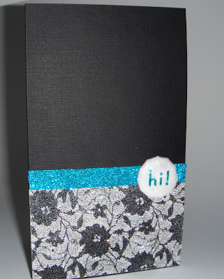
 There was a rubber stamp show here in Portland over the weekend.  I learned this fabulous "glitter lace" technique.  So simple for such stunning results!  It was a challenge to get all the sparkle and glitz to photograph well, but I think you get the idea.  I used the technique to create a card for this week's sketch challenge over at the LIM challenge blog.  Goodness, there is so much talent and creativity to be found there.

https://blogger.googleusercontent.com/img/b/R29vZ2xl/AVvXsEjYllVXc9lpy6LIPBGPuB5E-VQcG_ywCkHozU2AW7jh_zoToI-Y4vAN7OCsAWKEu6VL1JnTlUpoaXvf2RcEpSSD0iFQRhzZgZSKw-aFAqvY3IM53m_IJ5Zts8cpM1LT7z9ZNEid5RSBjsom/s1600/Less%252Bis%252Bmore%252Bsketch%252B1.jpg 
Here is the sketch for this week's challenge.
 It may look like there's actual lace on this card - but really its all glitter.  The lace only acted as a resist.  I will post a video on this technique so please stay tuned, or subscribe, to learn more.
 Tools are a big part of what's fun about crafting, wouldn't you agree?  My husband's 12 y.o. was more than ready and willing to help out in the creation of this simple glitter brad using my iTop bradmaker.
Here are pretty much the supplies I used to make this card.  Easy-peasy... and fun!  Let me know what you think, I really enjoy all comments and critiques.  Happy crafting!

Sunday, March 20, 2011

Masculine (pt. 2): "Less Is More" Chgallenge Blogspot

 So here we go with another round of masculine cards on the oh-so-fun LIM challenge blogspot.  My husband is a golf fanatic!  In fact, what's he doing on this blustery weekend afternoon - watching a tourney on tv.  Conditions aren't great for play, and as we currently live on a course, he can afford to be picky.  I could also give this card over to his dad who plays about 250 rounds a year during retirement.  In my house, this is definitely a guy's card!

Unknown cardstock in cream.  StazOn black ink.  CTMH "Tee Time" Stamps*  Natural colored cording.  I had thought to add the ball hanging from the cording, but decided "less is more."

*This set of acrylic stamps has gotten quite sticky.  After inking them up they actually would stick to the cardstock, tearing it a bit.  Hence the sort of blotchy effect was the best I could achieve.  What to do?  Sand them with some fine grit sandpaper?  Hmmm...?  Anyone else have this issue with acrylic stamps?  Set is probably only 2 years old and stored away from light.


My husband's 12 y.o. son is loving Tae Kwon Do.  At his next belt test he will be going for a green belt so I thought this would be great.  Interior of the card is handwritten, "Focus!  Confidence!"  This is what the kids shout out before breaking a board to complete the test.  I wanted the paper strip and knot to resemble the belts of his uniform.

White cardstock and Bazzill Basics cardstock in green.  Alphabet stamps from PSX: Celtic.

Thank you for stopping by.  I appreciate all comments and critiques.